Blog
You Might Also Want to Read
What’s With the New Google Logo?
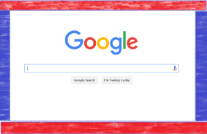
Google recently made headlines in the news for something a little more subtle than usual: the company unveiled a new, evolved logo. While the font change might not seem like a paradigm shift, the rebranding of the company goes to shows the importance staying modern and adapting to the latest trends in technology. The new logo is rounder, softer, and more modern. Like before, it remains simple, uncluttered and friendly. So why did they change it if it wasn’t that different from before? The new Google logo is a direct response to how people use its services. While Google’s original…
Absolute Admin September 2, 2015 (Updated on February 5, 2016)- 2 min read

The new logo is rounder, softer, and more modern. Like before, it remains simple, uncluttered and friendly. So why did they change it if it wasn’t that different from before?
The new Google logo is a direct response to how people use its services. While Google’s original purpose served users on desktop computers, today is a different story. You might not always be sitting in front of a large, bright monitor when making a search inquiry. You might be on a dimly lit phone, while searching. One post of the Apple developer blog once aptly stated, “Fonts lay at the intersection of design and engineering.” In other words, Google’s font change had a directly utilitarian goal of improving user experience.
“We’ve taken the Google logo and branding, which were originally built for a single desktop browser page, and updated them for a world of seamless computing across an endless number of devices and different kinds of inputs (such as tap, type and talk).” – Google Blog
Switching up the look of a logo, font or any aspect of a brand experience can be very important for the user experience. Facebook recently made a few changes including a slight modification to its font, as did Apple by making San Francisco its default font for developers.
Google has actually changed its font several times over the past decade. Five years ago, it removed the drop shadow, and three years later opted for a flat design by dropping the embossed style completely. Google has always kept its ear to the ground in terms of contemporary design and the latest change is no exception. Watch the evolution of the logo below to learn more.
September 2, 2015 - 2 min read

6 Tips for Dealing with Negative Comments on Twitter